Ableton Live Redesign - Expanded Mixer
UPDATE: Giving back to the community!
You can now download all the PSDs from my GitHub page: https://github.com/nndmlsvc/ableton-live-redesign or directly from my website: http://nenadmilosevic.co/graphics/psd/ableton-live-redesign-by-nenad-milosevic.zip
🖖
Session View. Read about my @Ableton Live Redesign here: http://nenadmilosevic.co/ableton-live-redesign/
🎛️🎚️
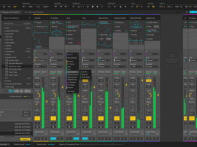
The Expanded Mixer is another View. So, you can toggle between Session View, Arrangement View, and Expanded Mixer View using Tab button. Or perhaps, by pressing the Show/Hide Expanded Mixer Section button next to the Show/Hide Mixer Section button. Located within View Options section.
Instead of Clips, the Extended Mixer View has Device Slots layered for each track vertically, top to bottom. Every Device Slot has different device’s parameters assigned. They can be added or removed by right-clicking on a specific device parameter and selecting Assign to or Remove from the Device Slot.
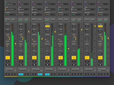
Because Expanded Mixer is taking a full-screen height, I also added track colors at the bottom of the channels for easier navigation. Stereo controls are pimped up with Panning, Balancing, and Stereo With (from Mono to Out of Phase). Additionally, It’s possible to choose between Panning and Balancing per channel.
I/O section is simplified to just three elements instead of four dropdowns and three buttons. Minimization is accomplished by having the first level visible and other sublevels shown on click.

