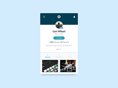
Profile Page - Devpost Redesign
Took some time to redesign Devpost's hacker profile page for practice. The goal here is to train my eyes to see what elements can use improvements from the original design.
Just some tweaks to make it more efficient:
• Reduce the size of projects for faster scrolling time
• Make the actions above the projects more obvious as to what you can do with them. In their design, I felt as though the horizontal scroll wasn't obvious at first glance until you realized 'Followers' is cut off.
• I reduced the call-to-actions in that action bar to 3. Click to select. The selected CTA is highlighted with color
• Reduce the dead space between the top navbar and profile picture. Most hackers on the site don't really upload cover photos
• Profile info is more organized and social elements are out in the forefront. I felt it was better to put followers and following in the container above instead of the horizontal scroll action bar.


