Vimeo Redesign Concept - WIP
Just started a new project for Uni, which consists on redesigning Vimeo's website and also repositioning it's brand with a new logo design.
My intention is to focus a lot more on the artists and their videos, and also establish strong connections between users throught the website.
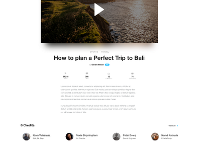
This screenshot shows the "video page". I wanted to give it a fresh new look, with a white background to contrast the video colours, and use a blurred effect to make colours even more pulsing.
The credits section displays other professionals involved on that project, and all their profiles are there linked - helping me establishing this connection of professionals throughout the platform.
This is a WIP, so, will keep posting stuff here as I go.
One great redesign I found, that I can definitely take some inspiration from is this masterpiece from Fayaz Mohamed.
