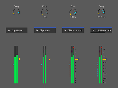
Ableton Live Redesign - Detail Level
UPDATE: Giving back to the community!
You can now download all the PSDs from my GitHub page: https://github.com/nndmlsvc/ableton-live-redesign or directly from my website: http://nenadmilosevic.co/graphics/psd/ableton-live-redesign-by-nenad-milosevic.zip
🖖
This is how Detail Level works in my @Ableton Live Redesign. Read more about it here: http://nenadmilosevic.co/ableton-live-redesign/
🎛️🎚️
Detail Level slider controls how many of the user interface elements you have on the screen. When the slider is on the left you’ll have only the basics and when it’s on the right you’ll have a very dense UI. Both are great for different users or usages.
Some need more granular control while others prefer a minimal number of elements, for different reasons. For example, if you’re performing live, you don’t want to hit the wrong button. But if you’re diving deep into the production, you want all the controls your DAW can offer. In terms of style, I’m gonna use a drums analogy. Some drummers prefer a lot of cymbals, toms, percussive elements, two kick drums, etc. while others like their sets really tight and basic.


