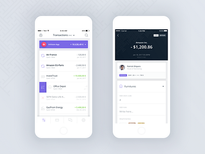
Qonto iOS App (first draft)
Hi Dribbblers 👋
This is my second shot of the @Qonto iOS App for which I helped the team put together a clean and light interface through out the whole App. Here is a good example of the work we’ve done: the “Hsitory” view is meant to show all transactions in a simple way with no unnecessary elements. We are pretty happy with the result! I’ve been using the Qonto iOS App as it is now (I’m part of their beta program) and although it has slightly changed, I have to say it’s pretty damn good and easy to use!
Hope you like it as much I enjoyed designing it 🙂
You can learn more about @Qonto on https://qonto.eu/ and they also regularly update their https://blog.qonto.eu/ for more insight on the product, tips on finance & more.
More by Qonto View profile
Like


