HBO GO - Mobile app concept
Hello world!
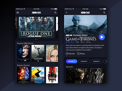
For my second post as part of the UIUX Killers, I showcase a new concept for the HBO GO app. The intention is to provide a modern look and improved UX by showing the newest movies and most popular series on the home above the fold.
The UI for movie/series pages include tags, i.e. HBO Originals. A revised placement of the Play button to make it easier for users to reach while browsing. Finally, I applied tags on the series detail page page to improve season navigation.
Feedback is welcome!
More by uiuxkillers View profile
Like

