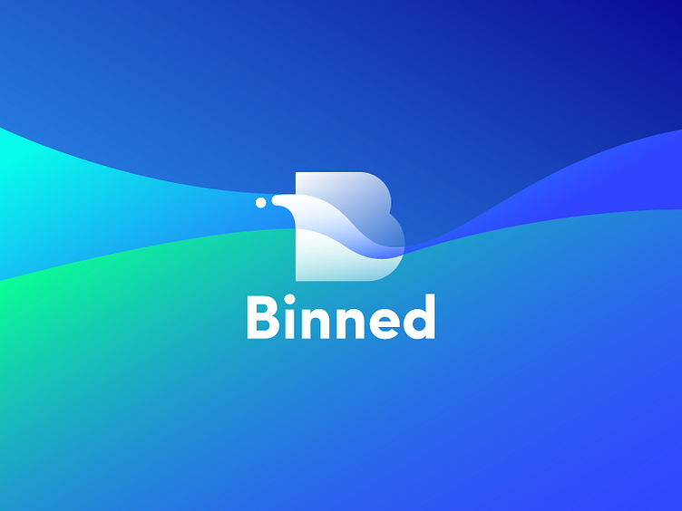
Binned Logo
Hi dribbblers!
No joke, health is among the key issues of happiness and welfare, and clean environment is one of its basics. One of our recent design projects was done for the company Binned which contributes much to clean and healthy environment for their local community. Today's shot features the logo designed for the company. It is the combination mark which includes a lettermark of the initial letter “B”, easily readable and reflecting the shapes of water splashes inside, and the lettering of a full brand name “Binned” made bold, simple and clear. The core color palette is in blue shades easily associated with water and cleaning. To see more, welcome to check the detailed case study and don't miss new animated shots for this project.
For more detailed cases sharing the flows of design projects on UI/UX, branding, illustration and animation, welcome to see them in the portfolio of Tubik Works. Join in!