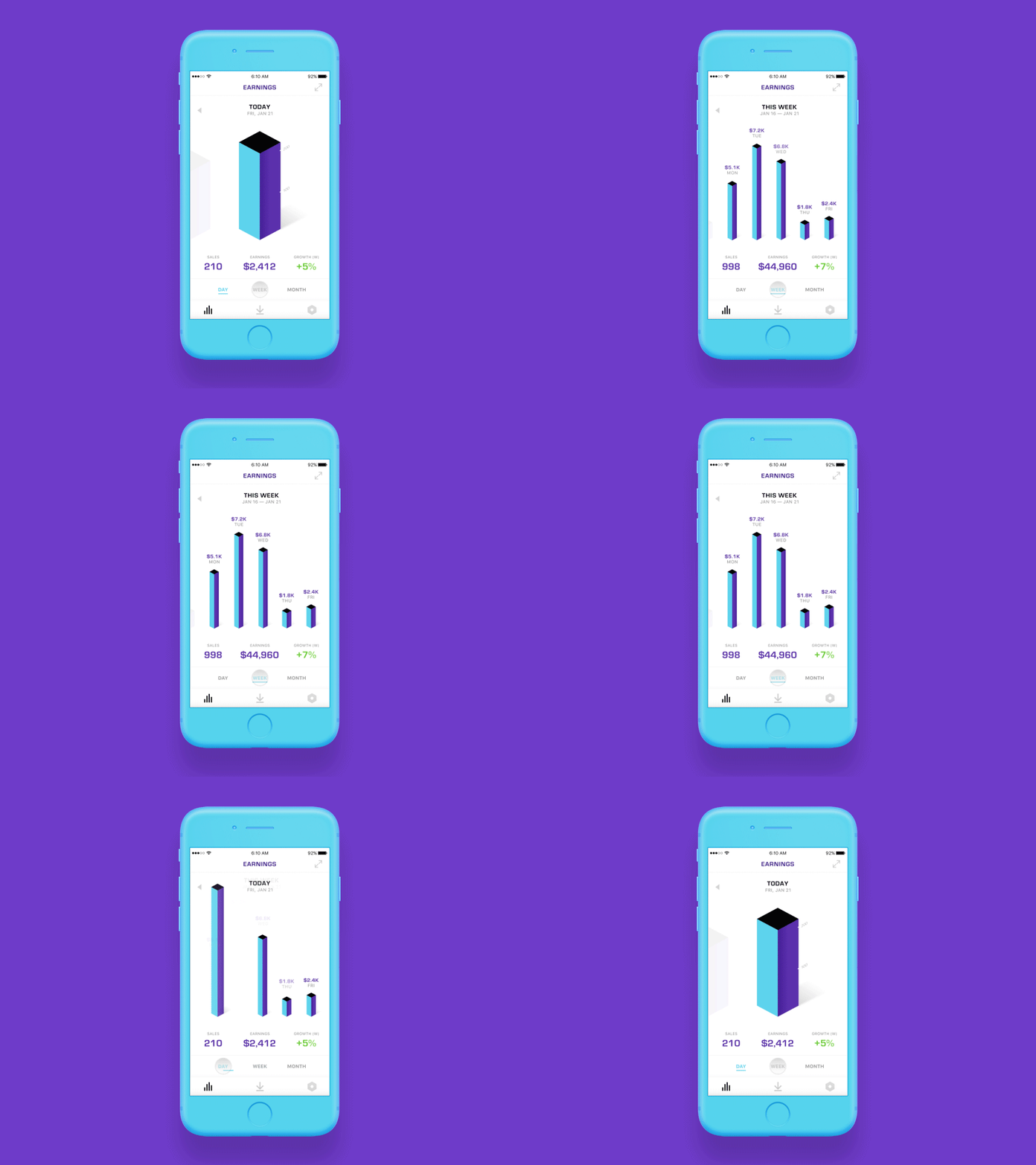
Fintech iOS App Concept
Screen transition between daily and weekly set of data (sales in time - day/week/month) from one of our design proposals 💸
I wanted to go a bit different from all those “flat” charts everywhere. Although we realized UX and usability of this idea is not good as we expected and will probably move into something more clear.
Also thanks to Jakub for a quick feedback 😉
—
🎦 Watch my latest design-related video on YouTube
👀 Follow my design process on Instagram
More by STRV View profile
Like


