Shades of gray
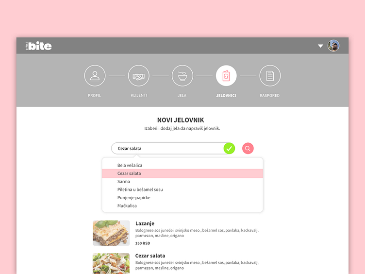
When working on UX I usually use just shades of gray and one or two accent colors to distinguish CTA and current state. Minimal UI is used only in terms of making it easier for the user to test the application. I don’t get attached to the final design, meaning that my colleague who is polishing the UI afterward can change the look of all the elements, as long as they send the same message and stay in the same correlation to each other.