VRU
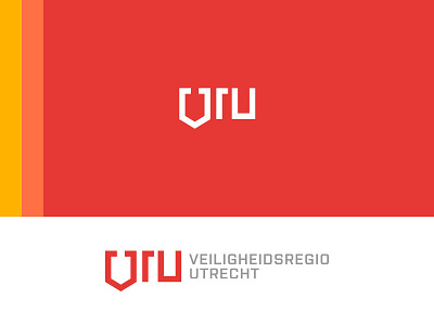
So I came up with this random concept for a redesign for VRU, Veiligheidsregio Utrecht.
Veiligheidsregio Utrecht (Security Region Utrecht) is an organisation that's mostly known for their management of the fire department from the Dutch province Utrecht.
The concept speaks for itself I think, with the V being a shield (a symbol of safety). The shield is also referring to the logo of the Dutch fire department.
I'm happy to hear your guys opinion on this redesign. Also let me know if you guys are interested in more concepts. I'm happy to make this into a little project, since I'm a small fire department enthusiast ;)
More by Bauke Snel View profile
Like
