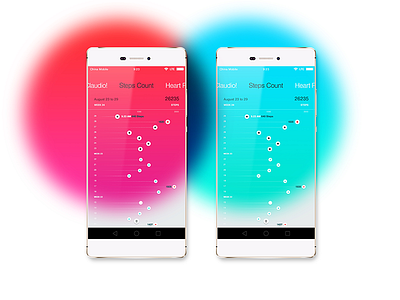
Health app concept
Hi Dribbblers,
Recently I came across these comps I created back in 2015 for a health app project I worked on briefly. This is just a small bit of it but the overall concept was to have a "thumb friendly" horizontal swipe navigation to change sections and use the big splash of color to indicate the type of exercise + your current performance at it based on the goals you had set previously.
See a bigger version of it attached. I have tons of snippets like these I'll keep sharing moving forward. I hope you like it.
Thanks.
@claudioguglieri
More by Claudio Guglieri View profile
Like

