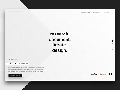
Portfolio Redesign - New Homepage
Still working on my new Portfolio Website concept.
I've added this square background layer to help guiding users to the center of the screen, and also highlighting the bottom content.
Another change from the last version: the menu button at the top right hand side is gone. By removing it I made users 1 click closer to it's content, and aesthetically it ain't a big loss.
Previous design: https://dribbble.com/shots/3512720-Portfolio-Redesign-Homepage
More by Arthur Finkler Freiberger View profile
Like
