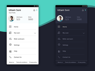
Light and Dark in UI Design
Light and Dark in UI Design i not just matter of choice. Its a matter of understanding and knowing user behavior, needs, time of usage, preference, age group, battery , type of content, etc.
Light UI are more intuitive and navigable, Mostly good for text-driven stuff.
Dark Ui are eye and battery friendly,used effectively that focuses heavily on visual content.
There will be times when light color schemes work best, and times where dark can work best.
Having both is always an good option :)
#design #darkUI #lightUI #clean #new #UnderstandYourUser #WWDC
More by UTTAM SONI View profile
Like

