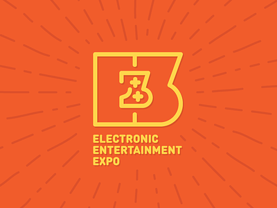
My vision of aging E3 logo
Actual E3 logo is painful for my eyes, i decided to redesign it. The gaming are the theme of the convention, so i made a gamepad in the center, and playing with lines for giving a double reading of the letters and gamepad. A gaming convention's logo must be playful.
More by Bearded Bear View profile
Like
