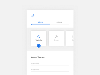
Cancer Stories Sign Up
So, some of you may know, some of you may not know (now you all know), but I had testicular cancer a few years ago. I'm pretty open about it. It's in remission and things are well, but it remains an uphill battle psychologically — what I mean by that is, I almost have a heightened sense of my body. If something feels off, it triggers this innate fear. I am of the belief that this fear, this anxiety in a way, can be overcome by sharing stories and experiences with people who have gone through similar things, and can in turn help you grow as a person.
I've been reading @Intercom book on Starting Up (you should buy it - it rocks), and CEO Eoghan McCabe states: "If you're trying to create a company [or product] that's successful, and you want to make something the market really wants and needs, do yourself a favor and build something you actually understand."
While I'm not building a company, and while I'm no doctor or psychologist, I guess you can say I understand cancer and the impact it can have on people, both young and old.
So, instead of creating random bits and pieces of UI for this "Daily UI Challenge", each with no purpose, over the next 100+ days I'm committing myself to create thoughtful, purposeful UI (sometimes based on the prompts - sometimes not), for an app that brings together a community of those who have battled courageously. A community where people can share their story, as well as hear the story of others.
I'm sure something like this already exists, in fact I probably should've checked that before wireframing and subsequently creating this. Regardless, I'm going to wireframe, concept and build it the way I (or any customers for that matter) would want: an inclusive community where people can have this openness, along with a smooth user experience. Colors will evolve, typography will evolve, logo (which is currently FPO) will evolve. I promise you'll see more coming soon.
Oh, almost forgot, this was my first time actually putting Figma through a rigorous test, and I must say, I absolutely love it. Sketch, Photoshop and XD will always have special places in my heart, but Figma is the future, for me at least. Really, whatever works for you as a designer, works for you.
Lastly — while I thought about the concept more as I laid in bed last night, the usability of that cancer selection container, where you can select the type/s of cancer you had is not efficient, people won't want to scroll through the cards (even if in alphabetical order), but more so actually be able to search the cards. Also, people may want privacy so I may make the name optional, which would free up space a bit more. Just talking out loud here. So as I keep adding and building out this app more, I'll be making revisions to the UI/UX of previous screens.
Anyway, I'm looking forward to challenging myself even more these next few months. Cheers!
EDIT: @Damian Kidd gave me some honest feedback (if you haven't already, you should join us at Blackformat, it's reasons like this community that I'm inspired every day — shameless plug) It looks like a hospital and is a bit uninviting. He's exactly right. I will warm the colors up, and the look and feel with the next iteration, and make people feel more welcome, you probably won't recognize it. In his words, the app should give off a sense of serenity, a zen-ness.

