Big Data is Beautiful
I've been cutting my teeth on data visualization lately. My explorations have been focusing on making the graphs easy to interpret as well as delightful to see.
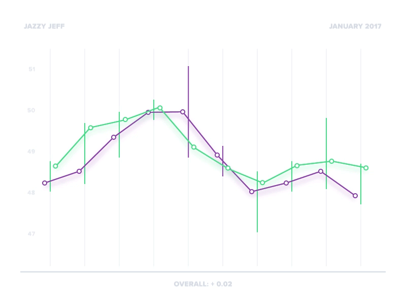
I wanted to avoid abstract graphs by using real data points in my explorations. For this one I wanted to visualize a bar chart for stock markets. Specifically I wanted to see how it populates the data set and how to highlight trends for users.
I like the results so far but I know this is only a starting point. Have you found any tricks to making beautiful and meaningful graphs?
As always feedback is appreciated.
Made with Underbelly