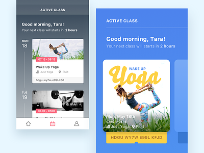
Fitness App Exploration
Been using GuavaPass app lately and I’m interested to explore how to organize the information on its Active Class screen.
Based on this article, https://uxplanet.org/design-principle-organizing-information-343a7ef936a8, basically the information can be organized by LATCH: Location, Alphabet, Time, Category, and Hierarchy.
Both images (#1 and #2) are organized by Time and Category. Time is best used to present events on chronological order and fixed duration. Category, as we all know, is used to group similar item together. #cocoklogi
–––––
Thanks to @Reza ilmi for fine-tuning the typography, color, and icon of this shot (ok, it’s almost everything) 😅
More by Riska Fadilla View profile
Like


