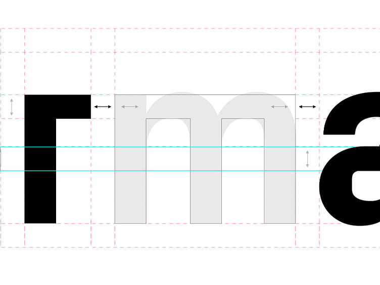
Custom version of Px Grotesk
Day 2 - Our custom logo, using PX Grotesk. We worked with type designer Jayson Zaleski, to take our new brand typeface, Px Grotesk and set our new wordmark in it, and fine tune it to visual perfection.
The sharp angles of Px represented the new direction we were moving towards: bold and assertive. The 'm' was the most obvious change, to literally raise the bar, helping to create more symmetry across the final solution. We also made some minor tweaks to evenly distribute the crossbar and arms on either side. And a teeny, tiny tweak to the eye of the 'a' to give it it's own subtle little crossbar.
Tomorrow we'll take a look at our brand new icon library.
Logotype by Jayson Zaleski
More by Format View profile
Like
