'Realign' - Old Logo Design
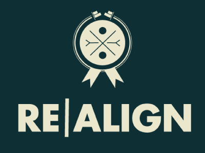
The word align means to give support to something. At the top of the logo I have used the symbol from adobe software to convey this message in the logo, the underlining meaning is we are going to utilise creative media to realign an area of stigma and despair (Irish media and social media) (using two to show we will do multiple things). • Realign means to change a position of something, especially in relation to the position of something else. • From this, I have created a black broken circle symbol to convey how we can realign the focus with unity and hope to conjoin with a creative media message. The broken lighter black circle is for the lack of mobility in this concerned area, our project plans to fix this. The two ribbons at the bottom are for the connection with awareness and mental health. • The color beige is neutral, calm, and relaxing; it also has a conservative connotation. • A circle in centre means a specific number of people; I use two again to show there is multiple. • The word empathy the ability to understand and share the feelings of another, I have illustrated this by designing the empathy symbols. This symbol stands for two sides reaching out for each other, and to truly understand others experiences and feelings. • I use the x as an indicator and identifier to our specific idea. • If you look closely at the design in the middle you can notice two people joining together. This is the connection we have with our project and the people living with schizophrenia. • All the above links in perfectly with our project and what we plan to do.