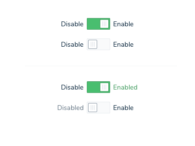
Toggle Clarity
Toggles can be confusing. Is it showing the action to take or the action that has been taken?
Also, they often get used when a checkbox is a better choice. Unless you are enabling/disabling something, there is likely a better UI element choice.
Here I am exploring how to make it painfully clear what is selected and how to take action.
More by Carri Craver View profile
Like
