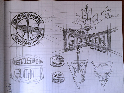
Goshen Guitar Works, phase two: first digital pass


After the sketches, it's time to do a first digital pass, draw the shapes, pick some typefaces, some color combos, etc.
The first concept was based on a vintage bicycle head badge shape, but didn't translate well. The typeface used is Lost Type's Sullivan.
The second concept was also based on a old badge shape of some kind (old kitchen appliance maybe?), but suffered from poor information hierarchy/flow. The typefaces at play are Growler Script, and Yonder, from @Jeremy Vessey's Hustle Supply Co.
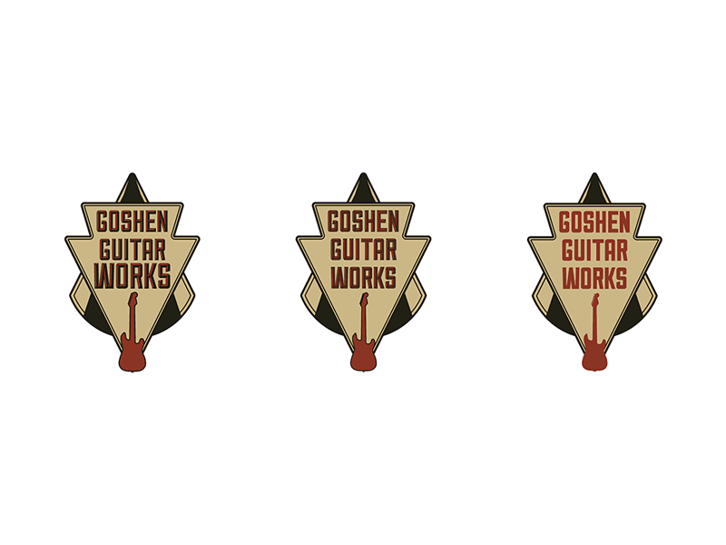
The third option was a more stripped down badge approach, with again Growler Script, and Yonder.
Finally, the fourth option. It all came together after changing element hierarchy, and playing with my favorite vintage color combo (orange/dark gray/off white). The client liked #3 because it featured a circular element, but felt it could use some additional elements to make it a throwback to badges of yore. So back in came the established date, a few of his specialties, and extra shapes.
Next up: color explorations, and stripped down versions.