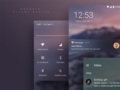
Android Fluent Design
Following my case study with fluent design introduced by Microsoft I decided to do something "crazy"and merge AOSP user interface with fluent design guidelines trying to stay as close to stock as possible.
In the end I see a nice hypothetical conversion between the two design languages. The only thing different from stock functionality wise is that I divided the notification pane from the quick settings pane, kind of like apple because usually I see the quick settings getting in the way of usability. You can dropdown notifications pane from the left side while quick settings from the right.
I don't see this as a problem since most android phones are too big for single handed use either way.
What do you think on this crazy little experiment?
Hit "L" if you liked it.


