DAMN.
DAMN.
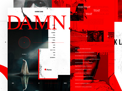
This was a fun one! I love the way that music influences design. I read an article hating on the designer of this album cover because it looked like "anyone could have done that". He replied that he wanted to portray a "loudness" with the typography choice and a sense of deep emotion with the portrait of Kendrick. Everyone thinks they can be a designer these days. It's not that simple. Even the most minimalistic design has an unbelievable amount of thought and purpose that goes into it.
I wanted that same "loudness" to come across this entire page layout. I tried a lot of different things on this one and really wanted to push my comfort level with the use of this bold red, highlighting the entire bottom half of this site.
This was designed 90% over the course of one day after Kendrick Lamar released DAMN. I put the album on repeat. It cleared my head completely, I got in the zone and this is the result.
The power of music is REAL.
Full pixels attached.
-
Searching for your True North? We would love to hear about how we could help. Email us hello@mag.cr


