Keen – Initial AD
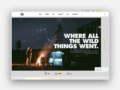


This is the original art direction that I had done a while back for our Keen redesign. While these initial art direction explorations are far from finished products, I largely wanted it to convey:
• a feeling true to exploration & outdoors market– use a little grit, but not too tacky/overdone/ too skeuomorphic
• keep the mood light with (FPO) random illustrations mixed in, light tone in copywriting (im clearly no copywriter), & a neutral canvas for bright lifestyle imagery and product photography
• mix things up with product presentation
• embed lots of little details to encourage exploration + promote outdoor exploration / keen culture
• Right align headlined– not sure what I was thinking with that... eh. Mixed emotions in hindsight.
• I make no apologies for my trendy AF & off brand serif + brandon type exploration. It was my obsession at the time that I thankfully could see past.
I had a lot of fun with this one. From here, the final designs evolved from this and some other initial directions with a lot of hard work from our team– you can see the live site here. To also learn more about the project, take a gander at our full case study over at the BASIC site.