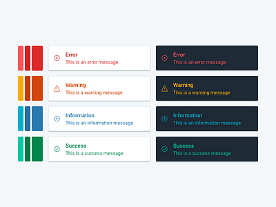
Notification colour system
Our design team is currently building @Onfido's design style guide. Here is a sample of the work I've done around @Onfido's colour system. For these notifications, I chose highly-contrasted colours to ensure readability. We want our colours to be vibrant but also to support the messages we deliver to our users.
More by Onfido View profile
Like
