Daily UI 2: Credit Card Checkout
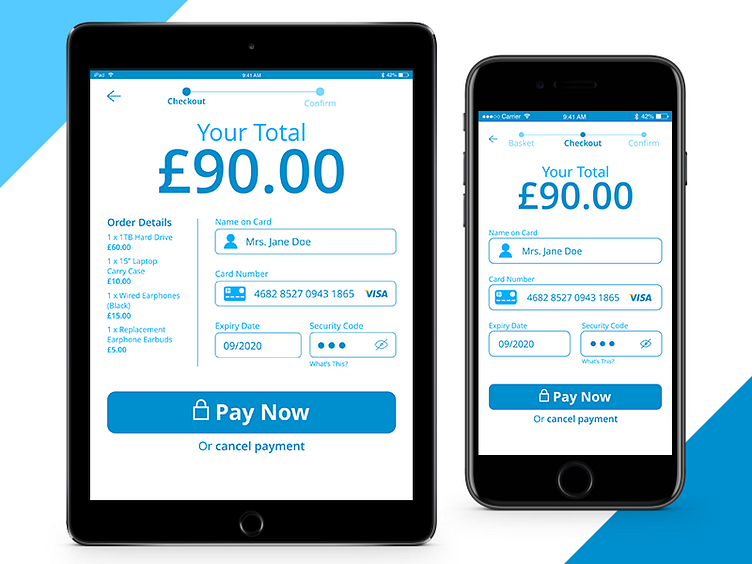
The second daily UI challenge involved creating a credit card checkout screen, and I decided upon a design which conveys clarity and trust through its clear hierarchy and calming colour palette of blues and white.
One of my main concerns was to design this checkout screen for more than one screen size, something I have not done before. Redesigning the screen for iPad allowed me to reduce the three sections seen in the iPhone design to only two in the iPad version due to the increased screen size.
What do you think? Any useful feedback is welcomed, thank you!
More by Richard Gray View profile
Like
