Simple & elegant
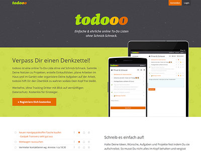
I had many iterations over the new home page of my todo-app. It is the first redesign in over 10 years now - hence the name with three o's 😹
I tried to keep it simple, informative and to the point. If you scroll down, you'll get short overviews of the functions.
It's in german, but do you like it? Any constructive feedback?
If you have time, take a look at the relaunched site: www.todooo.com
More by Henning Stein View profile
Like
