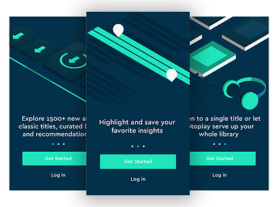
Blinkist Onboarding Redesign
As a user I always feel that on boarding plays an important role in getting the user comfortable with the app since it's the first time a user steps into the app.
While using Blinkist I was really intrigued by the Interface and the brand language the app was following. There was just one thing which was of order i.e. the on-boarding.
Their current on-boarding displays the user a video of a scrollable UI enclosed within a mobile frame making it difficult for the user to read and understand the text.
Thus, I designed an on-boarding which could solve their current problem making it easy to read and understand through metaphoric illustrations what Blinkist is all about.
Please make sure to check out the complete pixels attached.
Also, the question still remains :
Whether or not Onboarding is important to the user?


