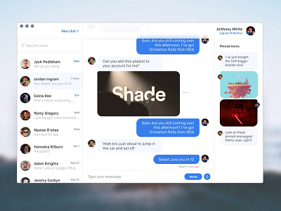
UI Challenge: Clean Chat
Not a daily UI challenge, more like when I have the time to do it.
Clean chat UI. Using minimal buttons and colours to keep everything feeling light. Using standard blues, totally not stolen from Messenger or iMessage.
Thanks for looking 🚀
More by Anthony White View profile
Like
