She Reads Truth v2 - Sprint 3: Bible Tools (expanded)
Sprint 3 was a deeper dive into the tools available to the end user when they are interacting with the Bible section. This was a fairly light and simple sprint overall.
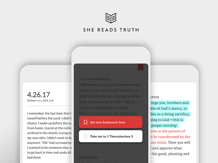
1. Further fleshed out the bookmark experience and what functions the user is presented. If the user taps the bookmark at the top of the screen, they're given the option to set that screen as their new bookmark or be redirected to the screen they had previously set. This sprint gave us the opportunity to define a user experience that we can use elsewhere in the app. I explored a few different directions for this, but landed here for the clarity the separate buttons brings to the user.
2. A new feature we are introducing is the ability to highlight verses. We selected a style and color for the highlight feature.
3. There are some instances that a user would want to do more than just highlight a verse. They may want to add their own thoughts to a specific passage or add sermon notes on a Sunday morning. The Notes feature will allow users to select a verse/verses and add a note. They can also add additional verses within this section. We chose a sans serif font for this section to keep the visual separation between man's words and God's words (bible). The user's notes can be accessed and managed in another section of the app.
