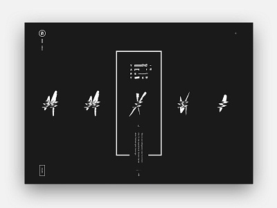
BASIC 2016 YIR
A bit late, but wanted to post up a shot of the final design direction we landed on with the BASIC 2016 YIR site. It was a lot of fun going through a ton of different design directions after literally being given a blank canvas. It took a little time to reach the far edges of what could be 'us', but then circled back on what felt right with a lot of input and collaboration form the entire team. To best describe the resulting design direction succinctly: its a juxtaposition of minimal geometric forms with unexpected tech (displacement and distortion)– resulting in a controlled chaos. It felt right for us.
Thank you everyone for the support on this one– this was a big team effort. We were stoked to have taken home an Awwwards SOTD and FWA SOTD on something that was damn fun to make.
You can check out some of the details in the attachments (including some of the other art directions I dove into initially, full page design, states, etc).
For a more in-depth look behind the build, we posted up a blog post with a lot more info and a short video with myself, Matt (Basic CEO & ECD) and Michael (dev lead).
And of course, see it live :)


