Logo Branding Anatomy


As promised, here's some more work for Worbby.
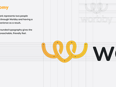
Anatomy
The logo mark represents two people connecting through Worbby and having a positive experience as a result.
Lowercase rounded typography gives the type an approachable, friendly feel.
More coming over the next few weeks!
And then the web app design afterwords.
Thanks!
View the full showcase, project context, and process in more detail on Behance »
—
Looking for a brand, web, ui designer? I'd love to hear from you. Email at: sasha@blueandyellowdesign.com
