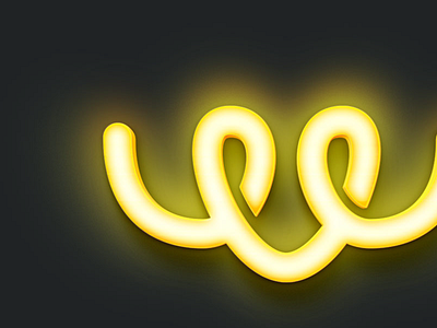
Worbby Branding
The Anatomy if the logo mark is that it represents two people connecting through Worbby and having a positive experience as a result.
Look and feel company keywords: passion; excellence; connectivity; collaboration; fulfilment; respect; trust; relational.
Thanks!
View the full showcase, project context, and process in more detail on Behance »
—
Looking for a brand, web, ui designer? I'd love to hear from you. Email at: sasha@blueandyellowdesign.com
More by Sasha Lantukh View profile
Like


