Daily Ui challenge #008
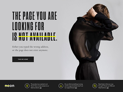
Hi hi, for day 8 I decided to go a bit against the design trends for 404. I decided to approach the page from a user perspective. The first point that came out of it is that, unfortunately, even if 404 looks very nice on a big page, it's a very jargony term that 95% of the users won't even understand. For this, I decided to give the page a more straight forward approach. Instead of having some fun things happening, the page is very simple and direct:
1) the page you are looking for does not exist.
2) you can browse back to home
3) or you can be redirected to a catalogue page, the FAQ or the live support.
The page was imagined as part of a fashion brand's ecommerce website called neon.
Let me know your feelings about it!
Typography
Circular
Tungsten
Cormorant Garamond
