WEHO Portraits
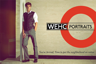
New design for a postcard for a new venture called WeHo Portraits. As in West Hollywood. The brand is meant to appeal to the affluent gay community. The type for the brand mark is done with Johnston Underground and yes it's meant as a near literal homage to the famed London Underground signs. It's meant to on the sly imply West Hollywood is the new swinging place to be. And it's not an accident that the word "Underground" comes to mind for this community that's still solidifying it's place in the social sphere.