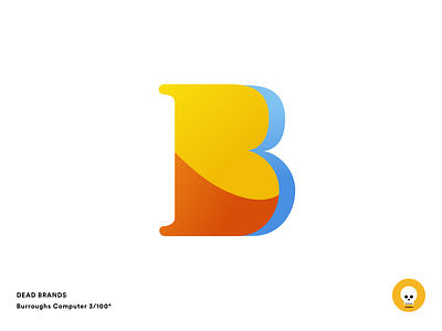
Burroughs Computer
I liked the curves of the original Burroughs logo so I wasn't going to necessarily throw those out. I first went with a rotation (see second image) on the letter but opted to go with a zero degree rotation to help reduce visual clutter. I pulled colors from the same color family as the original logo in order to keep with the tradition of the brand.
A little about Burroughs Computer:
(From Wikipedia)
The Burroughs Corporation was a major American manufacturer of business equipment. The company was founded in 1886 as the American Arithmometer Company, and after the 1986 merger with Sperry UNIVAC was renamed Unisys. The company's history paralleled many of the major developments in computing. At its start it produced mechanical adding machines, and later moved into programmable ledgers and then computers. It was one of the largest producers of mainframe computers in the world, also producing related equipment including typewriters and printers.
The old brand:
https://en.wikipedia.org/wiki/Burroughs_Corporation#/media/File:Burroughs_Corporation_(logo_ca._1947).jpg


