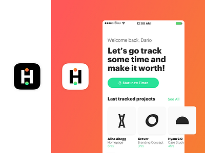
Daily Ui challenge #005 - Harvest Icon App
Yoo! For day 5 I decided to redesign the app icon for an app that I use quite often, Harvest. I decided to play around with their palette (green and orange) and add to it the metaphor of starting and stopping the timer. I designed the app icons in both positive and negative. While at that, I also quickly redesigned the app homescreen in a way that suits my work better. I hate to always have to go back to my previous day to find the exact names of the projects I have been working on, copying them in a new timer and start it again. It think it would be awesome to be able to start automatically a new timer based on the projects you were working on, say, the day before.
More by HY.AM STUDIOS View profile
Like
