Checkout Process
We recently worked with the guys at Partial.ly to redesign the checkout process for their merchants.
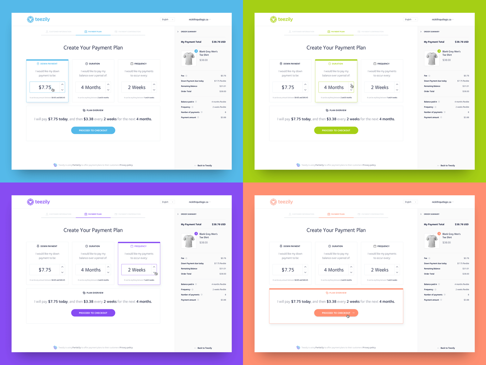
Partial.ly allows it's users to offer their customers payment plans. Allowing them to select a down payment, duration and payment frequency to pay items off.
The goal was to design a clean interface that would allow the user to brand that experience with a colour sampled from their logo, and look good in all different colour situations. The neutral design allows the merchants brand colour to pop as an accent colour throughout the checkout experience.
More by Input Logic View profile
Like


