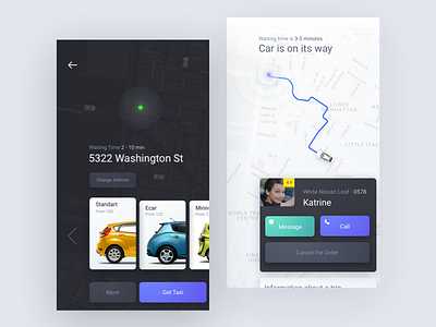
Rethinking Taxi App Design
Here’s a couple of screens of our new project. It’s an existing Taxi app. The main feature of this app is that user may not specify the final destination address. User just open the app, it finds his/her location and user pushes taxi “call” button. Customer wanted to redesign the app to make user feel more control by informing him/her about the current status of the order and additional microanimations.
We're available for new projects
hello@rondesignlab.com
More by RonDesignLab ⭐️ View profile
Like


