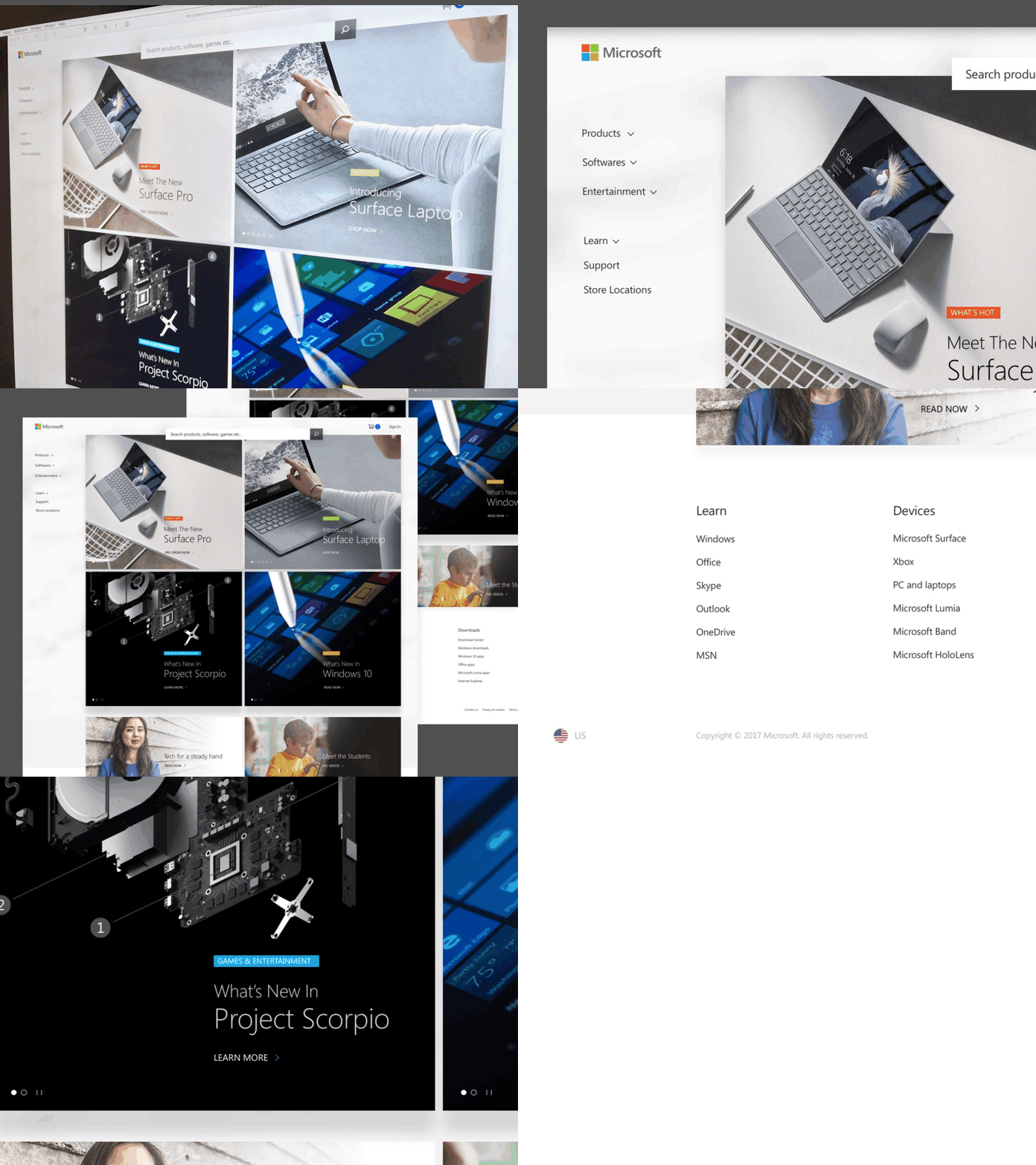
Microsoft's site redesign
Design practice - Microsoft's website (homepage) redesign
Objective with this redesign:
-Utilize the logo shape in the layout (for the categories) to make the design more unique and purposeful
-Label and tag each categories with color (from the brand colors) for more context
-Somewhat implement Microsoft's Fluent sidebar to reduce clutter on the top navigation
-Remove unnecessary text to add more focus to images/products, call to actions and reduce page scrolling
-Make search feature prominent without obstructing the main contents/images
-Implement Fluent's styles (subtle shadows on modules), and translucency (on the search button) to make the site future proof
-Make products standout more
See attachment for more detail.
Note: All photo images and the logo are owned by Microsoft.


