Modal
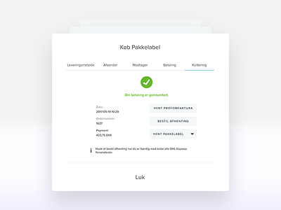
Redesigned a cluttered Payment Confirmation modal - into a more organised way. Problems with the initial one were the colours and information architecture. I opted for a top badge "grab attention" section - to tell you how awesome you did in the process and you are fine. You do not have to worry anymore - all your efforts came to an end. While for the section underneath I structured the optional data, the information that do not have to bother your mind at the end of such a long process. Cut off the icons as well. I do not see them essential or adding value. Attached the before and after.
More by 𝕵𝔢𝔞𝔫 View profile
Like

