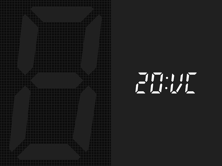
Twenty Minute VC Logo Idea
The Twenty Minute VC is an excellent, long-running podcast hosted by Harry Stebbings, one of the youngest venture capitalists in the world.
While exploring other projects, I pitched Harry this redesigned logomark for his brand. My goal was to make the mark look more like it sounds (the current mark has vc:20) and give it more balance and readability at small sizes.
I couldn't find a digital or LCD-style typeface that looked classy enough, so I made my own with a modified 'V' character (challenging to avoid making it look like a 'U'). The main character with the underlying pixel grid is in this shot to the left.
One thing I never figured out was what body copy could go well with this. Any ideas?
Give the show a listen if you're into startups! http://www.thetwentyminutevc.com/
