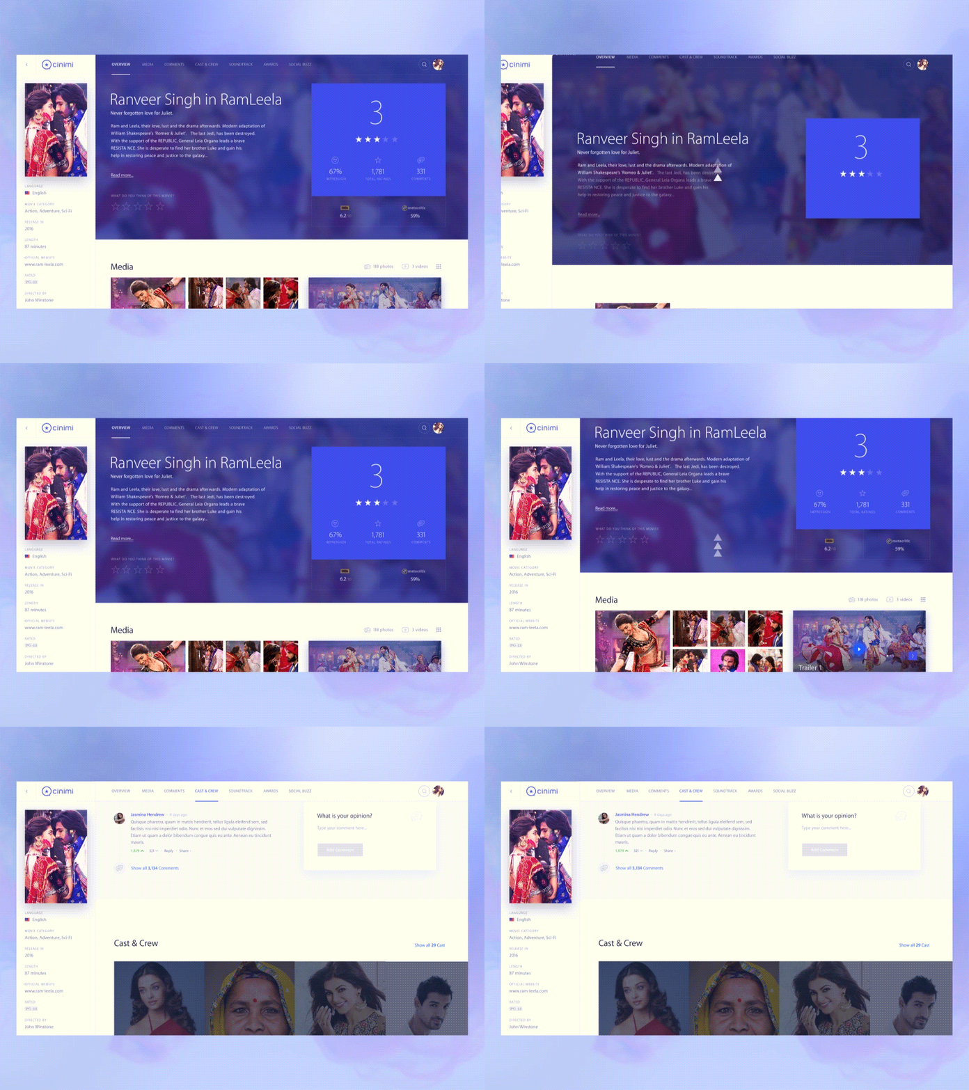
Cinimi: Scrolling
While we have been working on the UX strategy for movie detail page, we were trying to simplify the navigation through tons of different movie details. The most common problem is a cluster of information on any movie detail page. This often makes it harder to scan and find any details.
“Is it worth to solve this clustering of information problem at the expense of a long scrolling page?” That was the UX question we asked ourselves. The answer is “Yes”. Not only do users know how to use long scrolling pages but there are many ways how to improve the user experience. One of the easy-to-implement improvements is a sticky header. Basically, the navigation stays fixed on the top of the page so you can easily navigate. We also used the same concept for some of the UI elements like “Write a review” box next to the comments. See the attached image for more details.
Take a look at other examples of our work at https://goo.gl/WifsGe
Design by @Stanley Haladej


