1
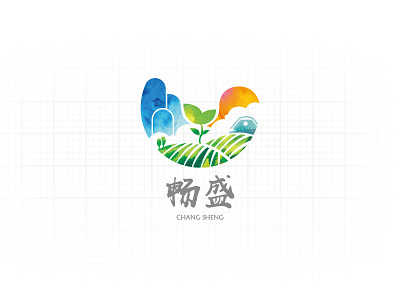
The entire logo is not only a concept or a simple meaning, but to give the audience a sense of substitution, through the smooth logo image so that the audience directly feel the smooth products of the Group's green, ecological, organic and other product advantages And let the audience agree with the corporate culture and to resonate. The entire logo of the carrier is an open up the "C" letter, "C" is the first letter of smooth English, open up on behalf of the growing and growing. In the "C" letter form the designer will be the elements of the pastoral landscape into which mountains, fields, sunshine and full of human homes are so that the audience has a relaxed and refreshing sense, the most important is the designer to use the watercolor texture effect , So that the color of the natural harmony and full of rich new Chinese style is high-end style and unconventional. In the middle of the entire screen is a growing bud is the visual center of the point, this buds symbolize the enterprise's products, the significance lies in our business products in the excellent natural environment and advanced business philosophy under the common Care for growth.
