Regulus Blog
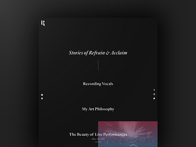
Posts page on a website I am designing for a local artist. I tried to create a very dark and minimal aesthetic that gives ample space for the content to breathe. Though when you interact with the photography and elements on the website they come to life with bright gradients creating a unique contrast.
More by Lee Campbell View profile
Like

