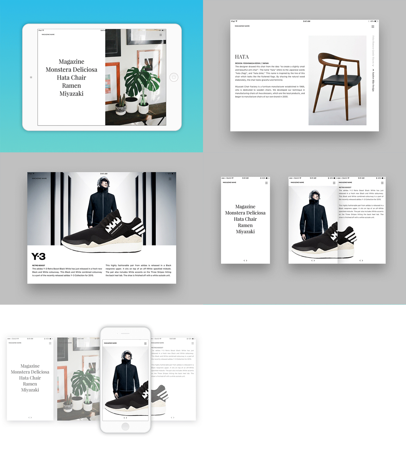
Digital Magazine layout concept
Press "L" to appreciate it.
"Digital magazine layout with horizontal scrolling" a personal project I'm working on.
I started on this project because I got a bit annoyed by many of the digital magazines distributed via Wype and Zinio or issuu.com for that matter, are not reader-friendly. I mostly use my non-retina iPad mini tablet (while I'm on the go) to read the magazines (you can forget about using your mobile :) and it sucks in most cases.
I wish that more magazine publishers / creators would make their digital version more reader-friendly and responsive and not just upload a (pdf?) file, with the layout that fits / is meant for the printed version....even though this probably means more work and setting up a 2nd layout :)
At my Behance page you can read a little more about the concept and see a few more mockups and a real life example.
What's your experience with digital magazines?
Cheers,
Janne
