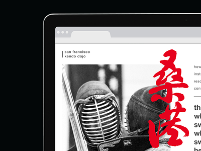
SFKD website re-design
It's been gnawing at me since I started in SF a few years back, that they needed to update the website. Right now it's very dark, and monotone. Kendo is such an explosion of energy that I felt the site needed to reflect that. Plus it feels kind of dated (sorry guys…), so I went back and expanded on this #DailyUI prompt.
Kept to the minimal approach and tried to create something clean and balanced that communicated the info quickly and concisely with a twinge of intrigue using rotating photos as the visual anchor.
Trying to flex my layout/ux/ui muscles to try and get out of this slump I'm in. This is up for feedback, so go to town folks!
~Leave a comment down below of what you think!
More by SJKM View profile
Like


