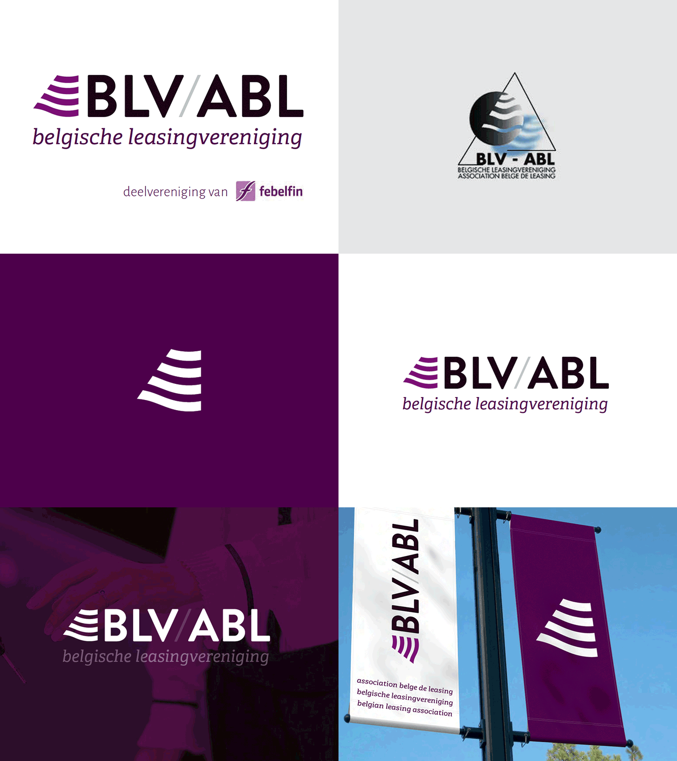
Logo, corporate identity, ux-ui corporate website
This rebranding is some work from over 2 years ago. I stumbled upon it recently, and I actually still like what I did there - lol.
The project started of with a content-workshop and some basic user-reseach for the new website - that resulted in a sitemap with extended wireframing. Starting with some visual explorations, we quickly agreed that the logo really didn't quite fit the message and tone-of-voice any longer.
In the proces of redesigning the logo I really tried to respect the components from the original artwork - because honestly: it's easy to break something down and start with a blank canvas but I'm confident someone actually has put its heart and soul in creating it - this resulted in a shape that's rather adaptive to its medium and works both in the logo and stands its ground as a symbol/mark.
As for the typography the straight hard lines & shapes of the ol' thrusted Brandon Grotesque work great with the soft serifs of Adelle, most probably because of Brandon's rounded edges.
The logo is for a Belgian Leasing Association, so the colorscheme works towards a certain 'sérieux' - and since there's a lot of firms involved in the Association, I went for a bit desaturated as well as rather darker tint - so there wouldn't be a color-link with any of the members.
I'm very happy how all this adds up. What do you think?
---
made at D'M&S
