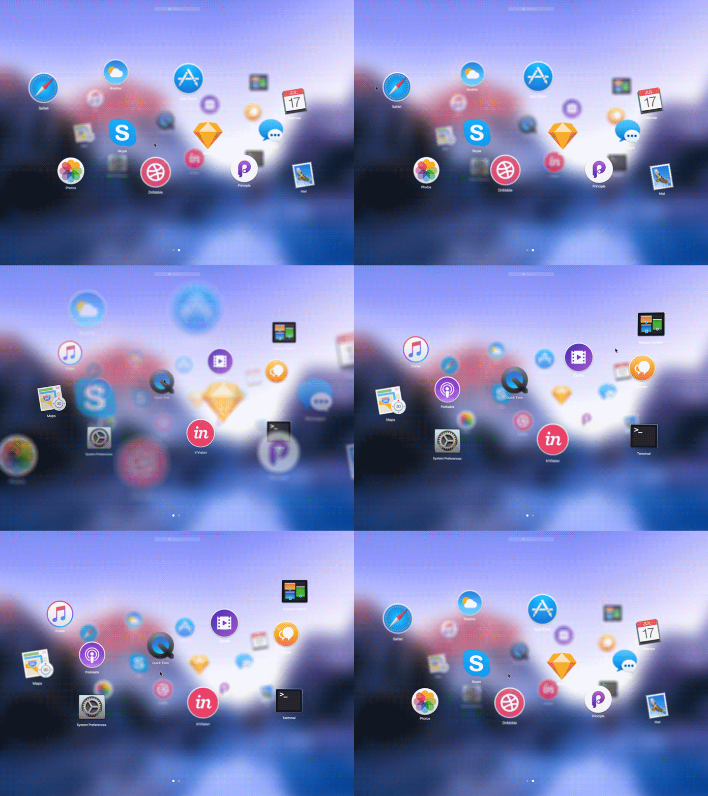
Microsoft Fluent Design System Experience in MacOS
The inspiration for today`s shot was recently announced Microsoft Fluent Design system. Its looking so vivid and fresh!
We put into action technical and practical realization of it here at Zajno. Video revealed by Microsoft was poor on details of how OS will actually look and feel, so, starting from a brainstorm we narrowed down to partial implementation of elements in MacOS. The Launchpad modernization seemed to be the most logical one. Adding the depth as a third dimension and sorting elements by their popularity revolutionize the engagement within the digital world. What are your guys' thoughts on this?
More by Volodymyr Hashenko View profile
Like
