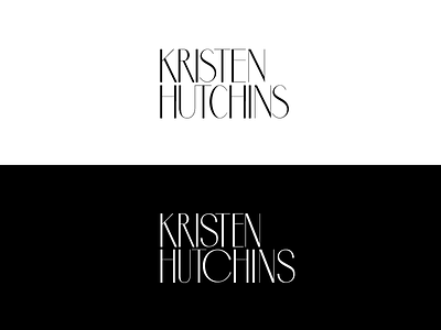
Before & After
Here's a little behind the scenes process to my wordmark making. I took the art deco font Mabre Sans and modified it to be unique and customized to her name. I wanted a very exaggerated circular C, wanted curvier S's and then narrowed a few letters to make sure the N's lined up. Was going for a very quirky playful look, but still hoping to keep it sophisticated.
Anyone else out there have a similar process? Would love to hear about it!
More by Amber Asay View profile
Like
